Case Study
WeMove
As a family-owned company, we understand the importance of a smooth transition. That’s why we make your move our top priority. From start to finish, we handle every detail with dependable service, genuine care, and a commitment to getting you comfortably settled into what’s next.
Problem
A new job, lifestyle changes, education oppurtunities, marriage, family growth, retirement etc often make people move or relocate to new neighbourhoods. Saying goodbye to a familiar environment and settling into a new one can be overwhelming.
Moving can be stressful without the right information, causing anxiety and fatigue through the process. Being informed and organized makes the process easier.
Solution
This website is designed to help movers find ease and effective solutions to common challenges that often arise during the moving process. WeMove is dedicated to providing comprehensive moving assistance, valuable mental support, and a wealth of resources, all aimed at ensuring that people can experience a truly stress-free move.
The goal of this website is to reduce the stress of moving by offering informative logistical support that focuses on stressless moving, and the overall well being of movers and their families.
Goals
Simplify the moving process from start to finish.
Reduce stress and uncertainty associated with moving.
Build trust through transparency and reliability.
Increase user engagement and platform usage.

Objective
Understand why people move and their emotional drivers.
Identify and prioritize movers’ core needs.
Pinpoint major stress factors historically associated with moving.
Design app features that directly solve those long-standing pain points.
Drive app adoption and user retention.
My Process
Research
*
Define
*
Ideate
*
Design
*
Prototype
*
Test
*
Iterate
*
Research * Define * Ideate * Design * Prototype * Test * Iterate *
Key Findings

Research
Competitor Analysis
Through my competitor research, I discovered clear gaps in today’s moving services and uncovered pain points movers consistently face. These findings directly shaped how I approached the WeMove app—guiding my strategy and design decisions to ensure the experience feels more supportive, seamless, and truly stress-free for the people who rely on it.


Test
Analysis of test result
For user testing, my goal was to conduct five sessions to observe how easily users could begin the moving process using the WeMove app. This helped me understand how intuitive the experience truly was for my target audience.
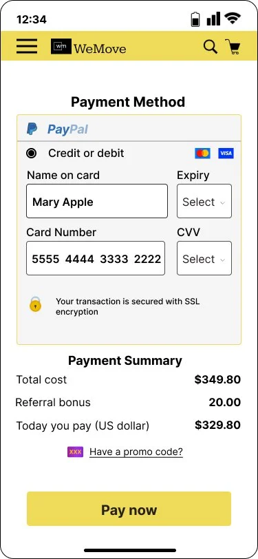
Most participants found the flow simple and easy to navigate, and all users were able to complete the moving task from start to finish without confusion. The primary feedback focused on improving the payment method, where users suggested clearer options and a more streamlined checkout experience.
Iterate
Based on user feedback, I refined the payment flow to include more detailed card information fields. Users recommended adding the cardholder name, CVV, and expiry date to enhance clarity and improve security. This update made the checkout process feel more trustworthy and aligned with standard payment expectations, strengthening the overall user experience.

This project had me learning through This project taught me valuable lessons throughout the entire process. I learned how small iterations can create meaningful improvements for users and significantly enhance the overall experience. As my first UX project, it has been instrumental in shaping my skills and preparing me for future design challenges.
I interviewed users to know their painpoints and motivation for moving. We found out that most people had a mix of pleasant and unpleasant experiences from moving, however the latter was more experienced. Most people exceeded their budget and found the process stressful.
User Interviews
“Looking forward to exploring my new community”
— Robert Li
“I was unaware of how stressfull moving can be”
— Ally Peters
“Looking forward to exploring my new community”
— Robert Li
Most competitors have the “Get a quote” button clearly stated in the home page, making it easy for clients to have an estimate of the booking.
They offer additional moving services to help facilitate the process.
The home screens of moving pages have trucks in motion illustrated or in pictures.


“I went over my budget, was not prepared for additional fees”
— Michael Jones
“Glad to move to a new home, but it is overwhelming”
— Mia Jamie

Affinity Mapping
Key Takeaways

Most participants were motivated by moving into a new home, whether upgrading, relocating for family reasons, or transitioning into a better space.
Overall moving experiences were mixed, with users describing both positive moments and significant frustrations along the way.
All movers had items to donate, indicating a common need for decluttering solutions during the moving process.
Stress was a universal theme, as every participant experienced some level of emotional or logistical strain throughout their move.
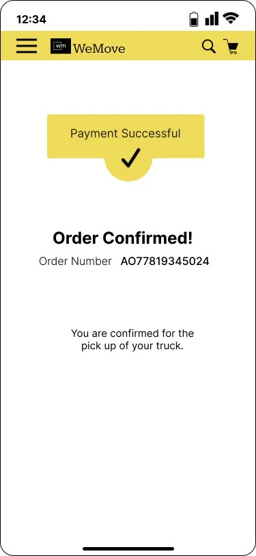
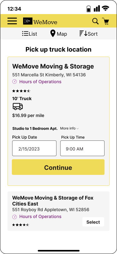
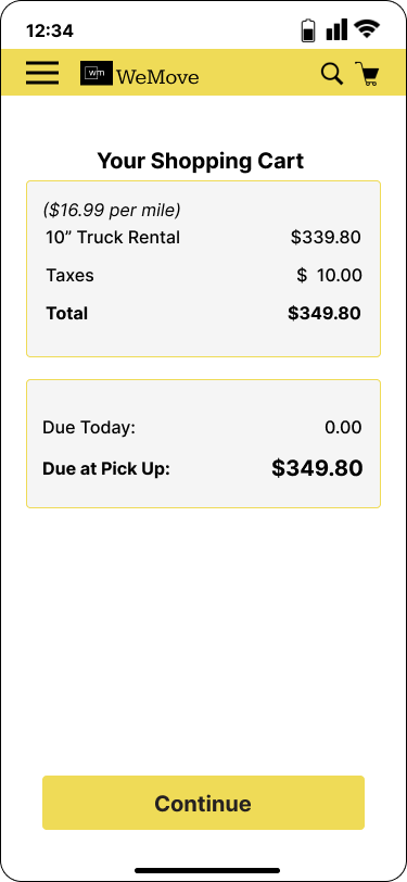
In this high-fidelity design, I refined WeMove into a smooth, step-by-step flow that makes booking a moving truck simple. Users enter their moving details, compare clear pricing options, choose a pickup location, review their cart, and complete secure payment. The final confirmation screen provides reassurance. My goal was to reduce stress and create an organized, intuitive experience that truly supports users through their move.


Define
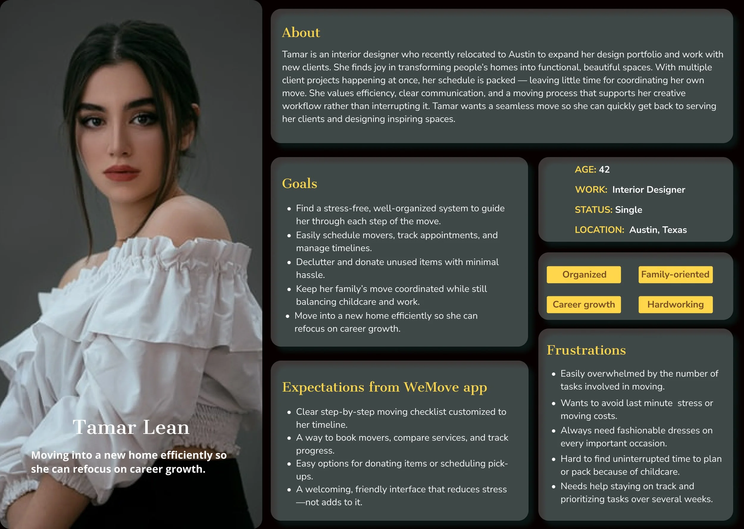
Who is my persona?
Tamar - a busy interior designer who loves helping people create beautiful spaces. She needs a smooth, efficient moving process so she can quickly settle in and refocus on her design work.
Sitemap
Ideate
Userflow

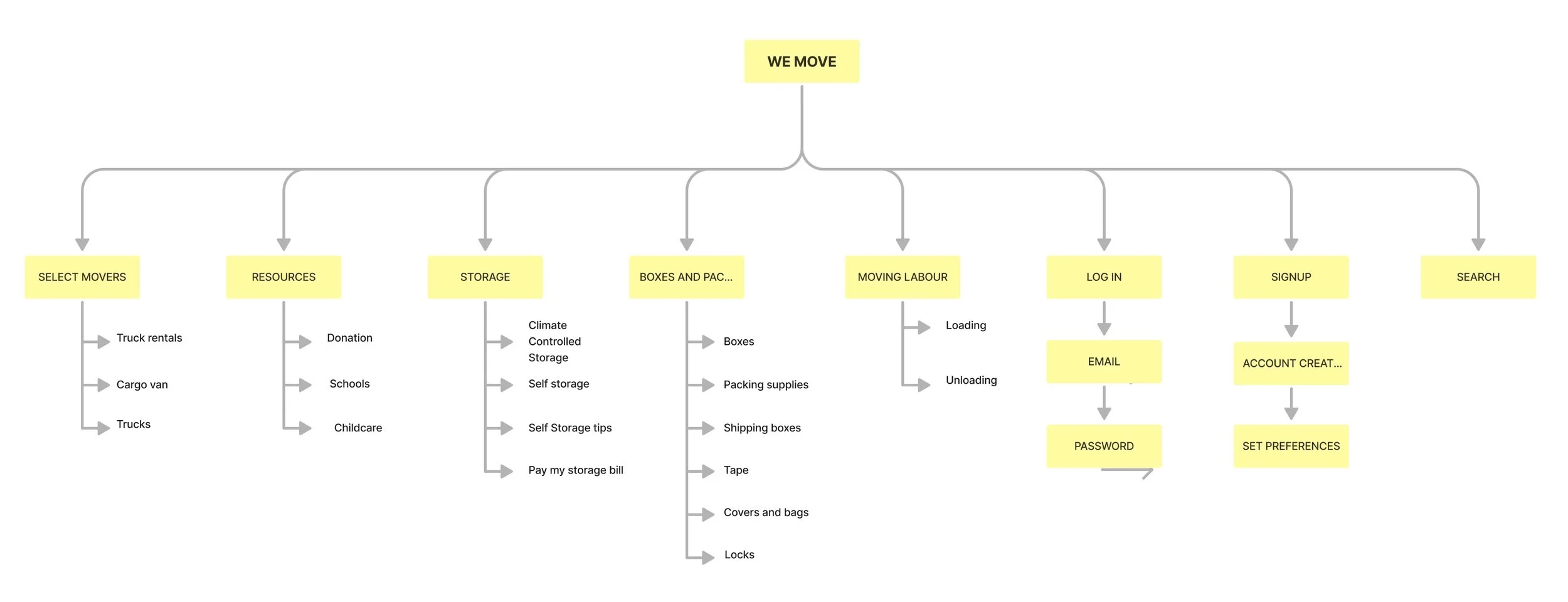
The WeMove sitemap organizes the moving process into simple sections—finding movers, resources, storage, packing supplies, and labor—making it easy for users to access everything they need for a smooth, stress-free move.
I designed the WeMove sign-up flow to be quick and intuitive. Users enter their details, the app validates the information, and once approved, their account is created and they can log in right away. If anything is incorrect, a clear error message helps them fix it. The goal was to make onboarding effortless and smooth
Here I outlined the branding outlook which includes logos, fonts, buttons and color palettes and more to create an engaging user experience and brand recognition.
High fidelity wireframe
Design
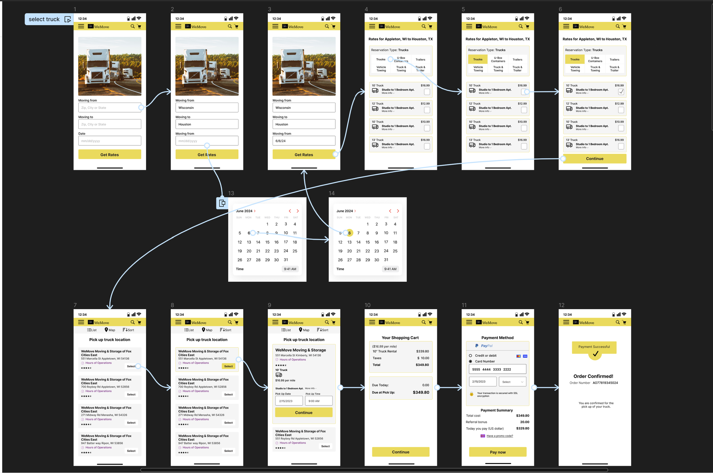
In this mid-fidelity design, I created a streamlined flow that guides users through the entire truck-booking process. They begin by entering their moving details, then compare available truck options, select a pickup location, review their cart, and complete payment. My goal was to make each step clear, intuitive, and stress-free—reflecting the experience I want WeMove users to have during their move


